What is Typography and Why Is It Important For Author Websites?

Typography for Author Websites
Picture this: A potential reader discovers your book through a recommendation and immediately searches for your website. They land on your homepage and within three seconds—before they've even read a single word—they've formed a negative opinion about you as an author.
The culprit? Your typography.
This isn't hyperbole—it's science. Research conducted at Missouri University of Science and Technology found that website visitors form first impressions in less than two-tenths of a second, with their eyes taking approximately 2.6 seconds to focus on the area that most influences that crucial first impression.
Just like you wouldn't want your next bestseller to sport a generic, unattractive cover, your website's typography shouldn't be an afterthought that makes visitors cringe.
Typography for author websites is the secret ingredient that transforms bland, forgettable text into compelling, professional content that builds trust and keeps readers engaged.
Here's the reality: the question “what is typography and why does it matter” goes far beyond simply picking a "pretty font." It's about creating a reading experience that reflects your brand, serves your audience, and positions you as a serious professional in the literary world.
Whether you're querying agents, attracting readers, or building your author platform, your website's typography is working for you—or against you—every single day.
In this comprehensive guide, we'll explore everything you need to know about typography, why it's crucial for author websites specifically, and how to implement typography choices that elevate your online presence from amateur to absolutely irresistible.
What is Typography?

Simply put, typography is the art and technique of arranging text to make written language legible, readable, and visually appealing.
But let's dig deeper, because there's often confusion around the terminology that every author should understand.
Typography vs. Fonts vs. Typefaces: The Difference That Matters
Think of it this way: A typeface is like a book series—it's the overall design family. Meanwhile, a font is an individual book within that series.
So "Garamond" is a typeface that contains many font types within it, while "Garamond Bold 18pt" is a specific font within that typeface family.
Then there is typography, which encompasses the bigger design picture.
Typography is how you arrange all these elements together, including font choice, size, spacing, hierarchy, and color. It's the difference between scattered words on a page and a cohesive, professional presentation that guides your reader's eye exactly where you want it to go.
The Core Elements of Typography Include:
Font selection: This forms the personality of your text
Size and scale: Creating hierarchy and emphasis
Spacing: Both between letters (kerning) and between lines (leading)
Color and contrast: Ensuring readability and mood
Alignment and layout: Organizing information logically
Website Typography: A Different Beast

Website typography operates under different rules than print typography. While your favorite novel might use a classic serif font that's beautiful in print, that same font might become illegible on a smartphone screen.
Web typography must also be responsive, loading quickly while remaining crystal clear across devices ranging from massive desktop monitors to tiny phone screens.
This is where web typography best practices become crucial.
Your typography needs to work for the reader scrolling through your bio on their morning commute just as well as for the literary agent reviewing your website on their office computer.
Not sure how to accomplish this? Continue on for more tips, common mistakes, and best practices.
Why Typography Matters for Author Websites
First Impressions and Brand Perception
Your website is the cover to your entire writing career.
And just like readers judge books by their covers (despite what we tell ourselves), visitors judge authors by their websites.
Author website design starts with typography because it's often the first thing people notice, even before they read your actual words.
Typography communicates your genre and personality before anyone reads a single sentence.
Consider these associations:
Romance authors often benefit from elegant serif fonts or flowing script elements that feel romantic and inviting. Think warm, approachable, with perhaps a touch of sophistication.
Thriller and mystery writers typically gravitate toward clean, bold sans-serif fonts that feel modern and decisive—fonts that whisper "I know what I'm doing" rather than "come sit by the fireplace."

Literary fiction authors might choose classic, established typefaces that convey gravitas and timelessness—fonts that have been trusted by serious publications for decades.
The magic happens when your typography choices align perfectly with reader expectations while still feeling authentically you.
Reader Experience and Engagement
Here's a sobering statistic: typography importance becomes crystal clear when you realize that most website visitors spend less than 15 seconds on a page before deciding whether to stay or leave.
In those crucial seconds, typography is doing heavy lifting.
Studies show that well-designed typography can increase reading comprehension by up to 20%.
More importantly for authors, good typography directly impacts:
Bounce rates: People leave faster when text is hard to read
Time on page: Readable content keeps visitors engaged on your website longer
Mobile experience: With over 60% of web traffic now mobile, your typography must work on small screens
Accessibility: Clear typography serves the 13% of adults who report vision difficulties

Poor typography creates friction. Readers shouldn't have to squint, struggle, or work to absorb your content.
Every moment they spend fighting your font choices is a moment they're not falling in love with your writing.
Professional Credibility
When literary agents research authors, when readers decide whether to subscribe to your newsletter, when event coordinators consider you for speaking engagements—they're assessing your professionalism. Typography plays a surprisingly large role in these snap judgments.
Typography importance for authors goes beyond aesthetics. It signals:
Attention to detail: Authors who care about typography often care about craft
Investment in career: Professional typography suggests you're serious about your writing business
Reader consideration: Good typography shows you prioritize your audience's experience
Current industry awareness: Modern, well-executed typography suggests you understand today's publishing landscape

Think about it this way: if you were choosing between two equally talented authors for a speaking engagement, and one had a website that looked like it was built in 2003 while the other felt fresh and professional, which would you choose?
SEO Benefits of Good Typography
Here's something many authors don't realize: SEO typography is a real thing, and it can help more readers discover your work organically.
Search engines favor websites that provide excellent user experiences. Good typography contributes to this by:
Improving readability scores: Search engines can detect when content is easy to read
Reducing bounce rates: When people stay longer, search engines notice
Enhancing content structure: Proper heading hierarchy (H1, H2, H3) helps search engines understand your content
Increasing engagement: Comments, shares, and return visits all signal quality to search engines
This means your typography choices can literally help more readers find your books through Google searches.
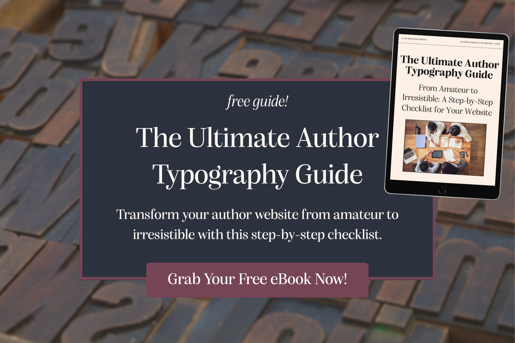
Looking to improve your author website? Discover common mistakes that authors make (and how to fix them) in “The Top 10 Typography Mistakes That Make An Author Website Look Unprofessional.”

Common Typography Mistakes Authors Make
Let's address the elephant in the room. I've seen countless author websites that could be stunning if not for a few critical typography mistakes.
The good news? These are all fixable.
Font Selection Errors

The "More is More" Trap
I get it—fonts are fun! But using five different fonts on your homepage isn't creative; it's chaotic. Author website fonts should follow the "rule of three": one font for headings, one for body text, and maybe—maybe—a third for special accents like pull quotes or call-to-action buttons.
Genre Mismatching
Using Comic Sans for your psychological thriller website sends mixed signals. Your typography should support your brand, not contradict it. I once saw a horror author using a whimsical, bouncing font that belonged on a children's party invitation. No matter how brilliant their novels, that typography choice undermined their credibility instantly.
Decorative Fonts for Body Text
That gorgeous script font might be perfect for your book cover, but it becomes a nightmare when readers try to absorb three long paragraphs of your bio. Decorative fonts are like hot sauce—a little goes a long way.
Readability Issues
The "Tiny Text" Problem

If your body text is smaller than 16px, you're making it harder for readers to engage with your content. Website readability starts with size. Remember, not everyone has perfect vision, and many people are reading on phones while walking, commuting, or multitasking.
Color Contrast Failures
Light gray text on a white background might look minimalist and sophisticated, but it's essentially invisible to many readers. Your typography needs sufficient contrast to be accessible to everyone, including people with visual impairments.
Cramped Spacing
Text crammed together without adequate line spacing (leading) creates a wall of words that feels overwhelming. White space isn't wasted space—it's breathing room that helps readers process information.
Hierarchy Problems

Everything Looks the Same
Without clear hierarchy, your website becomes a sea of uniform text where nothing stands out. Readers should immediately understand what's most important, what's secondary, and how information flows together.
Inconsistent Structure
If your heading sizes jump around randomly—H1, then H3, then back to H2—you're creating visual confusion that makes your content harder to follow.
Real-World Examples
I recently worked with a fantasy author whose website used:
A medieval-style font for headings (good genre match)
Comic Sans for body text (genre mismatch)
Hot pink text on a purple background (readability nightmare)
No consistent heading structure (hierarchy confusion)
After redesigning her website with a clean serif for headings, readable sans-serif for body text, and proper contrast, her website transformed from confusing to compelling.
More importantly, her newsletter signups increased by 40%.
Typography Best Practices for Author Websites

Now let's get into the good stuff—how to create typography that works beautifully for your author brand.
Choosing the Right Fonts
Best fonts for author websites depend on your genre, but here are some reliable starting points:
For Literary Fiction and Historical Novels:
Typefaces: Garamond, Minion Pro, Crimson Text
Why: These serif fonts convey tradition, elegance, and literary credibility
For Contemporary Fiction and Memoirs:
Typefaces: Source Sans Pro, Open Sans, Lato
Why: Clean sans-serif fonts feel modern and approachable
For Romance:
Typefaces: Playfair Display (headings), Lora (body text)
Why: Sophisticated serifs with romantic curves
For Thrillers and Mysteries:
Typefaces: Roboto, Montserrat, Oswald
Why: Bold, decisive fonts that convey confidence and urgency
For Fantasy and Science Fiction:
Typefaces: Raleway, Nunito, with custom display fonts for accents
Why: Modern fonts with subtle uniqueness, avoiding cliché medieval looks
Web-Safe Considerations
Always choose fonts that load reliably across all devices. Google Fonts offers excellent options that are free, fast-loading, and consistently displayed.
Avoid using fonts that only exist on certain operating systems, as they’ll cause your website to “break” when viewed by certain devices.
Establishing Hierarchy

Typography hierarchy is like creating a roadmap for your readers' eyes. Here's how to structure it:
H1 - Your Main Headline (32-48px) This should be your most important message—often your name or book title. Use it sparingly, typically once per page.
H2 - Section Headers (24-32px) These break the content on a page into digestible sections. Think about seeing "About Me," "Upcoming Books," and "Bestsellers” sections as you scroll down the page.
H3 - Subsection Headers (20-24px) Use these for smaller divisions within sections.
Body Text (16-18px minimum) Never go smaller than 16px for your main content. 18px is often even better for readability.
Font Weight and Style Guidelines:
Use bold for emphasis, not italics (italics are harder to read on screens)
Avoid ALL CAPS for anything longer than a few words
Use consistent spacing between sections
Spacing and Layout
Typography spacing can make or break your design. Here are the essential measurements:
Line Height (Leading):
Body text: 1.4-1.6 times your font size
Headlines: 1.1-1.3 times your font size
The longer your lines, the more line height you need
Paragraph Spacing:
Add space between paragraphs (0.5-1em)
Avoid indenting the first line of paragraphs on web (paragraphing is a print convention; using it on websites screams amature")
Line Length:
Optimal: 45-75 characters per line
If your lines of text are too short, it will feel choppy; too long, and what you’re saying becomes hard to track
Margins and Padding:
Give your text room to breathe; white space is not only beautiful but necessary on websites. Remember, you’re allowed to take up space!
Consistent spacing creates rhythm and professionalism
Color and Contrast

Typography accessibility starts with color choices that everyone can read comfortably.
WCAG Contrast Guidelines:
Normal text: 4.5:1 contrast ratio minimum
Large text (18px+ or 14px+ bold): 3:1 contrast ratio minimum
Use tools like WebAIM's Contrast Checker to verify that your typography has a high enough contrast
Color Psychology for Authors:
Dark text on light backgrounds: Classic, easy to read, works for most genres
Dark backgrounds: Can work for horror, mystery, or contemporary fiction but it requires careful contrast management to ensure readability
Color accents: If you have a brighter color accent, use it sparingly to highlight calls-to-action or important information
Mobile Typography
Responsive typography ensures your website looks professional on every device.
Mobile-Specific Considerations:
Font sizes should scale appropriately (never smaller than 16px on mobile)
Touch targets (links and buttons that you want web visitors to click on) should be at least 44px tall
Line length should adjust for narrower screens
Consider how your hierarchy works when space is limited
Testing on Multiple Devices:
Check your typography on various screen sizes, not just your computer. Remember, your readers are accessing your site from phones, tablets, laptops, and desktops.
Typography Tools and Resources for Authors
Free Typography Tools
Typography tools can help you make professional choices even without design experience:
Google Fonts (fonts.google.com)
The gold standard for web fonts. Free, reliable, and offers helpful pairing suggestions.
Font Pairing Tools:
FontJoy.com: AI-powered font combinations
Typ.io: Curated font pairings from real websites
Canva Font Combinations: Built-in pairing suggestions
Contrast Checkers:
WebAIM Contrast Checker
Colour Contrast Analyser
Built-in accessibility checkers in design tools
Typography Inspiration
Typography inspiration can help you see what's possible for your own website:

Author Website Showcases:
Study successful authors in your genre. What typography choices do they make? How do they balance personality with professionalism? Which style choices call to you?
Design Galleries:
Typewolf.com: Real-world typography examples
FontsInUse.com: Shows how fonts are used in context
Awwwards.com: Award-winning web design
Professional Services
Sometimes the best investment is hiring someone who lives and breathes typography for author websites. Consider professional help when:
You're preparing for a major book launch
You're rebranding or repositioning yourself
You want to ensure accessibility compliance
You'd rather focus on writing while someone else handles your website design
Implementing Typography on Your Author Website
Testing Your Typography

Typography testing ensures your choices work in the real world:
Readability Tests:
Ask beta readers to review your website
Use tools like Hemingway Editor to check reading level
Test on multiple devices and screen sizes
A/B Testing: Consider testing different typography choices to see what resonates with your audience. Many website builders offer simple A/B testing tools.
Maintenance and Updates
Keeping Typography Consistent:
Create a style guide documenting your font choices and sizes
Use consistent formatting across all pages
Regularly audit your site for typography inconsistencies
Performance Considerations:
Limit the number of font weights and styles you load
Use system fonts when possible for faster loading
Compress custom fonts if you must use them
Conclusion

Typography for author websites isn't just about making things look pretty—it's about creating an experience that serves your readers, builds your credibility, and supports your career goals.
Every font choice, every spacing decision, every color selection either moves you closer to or further from connecting with your ideal audience.
The most successful authors understand that their website is more than a digital business card; it's a powerful tool for building relationships with readers, impressing industry professionals, and establishing authority in their field.
Author website design that prioritizes excellent typography sends a clear message: this author cares about craft, values their readers' experience, and approaches their career with professionalism.
Remember, you wouldn't publish a novel without careful attention to every word, paragraph, and chapter structure. Your website deserves the same level of thoughtful consideration.
Good typography might seem like a small detail, but small details compound into significant advantages over time.
Start by auditing your current website typography:
Is it serving your goals?
Does it reflect your brand personality?
Is it accessible to all potential readers?
If the answer to any of these questions is "no," you now have the knowledge to make improvements that will enhance every visitor's experience.
Your stories deserve a beautiful home online. With thoughtful typography for author websites, you can ensure that your digital presence is as compelling as the worlds you create on the page.
Ready to transform your author website with professional typography that builds credibility and attracts readers? Let's create a digital presence that's as captivating as your stories.