
Why Your Books Belong on Your Homepage

Quick question: Are your books hiding on your website?
A lot of authors put so much time and care into writing their books… then tuck them away on a separate “Books” page that most visitors may never even click on. I get it—it feels neat and organized. But here’s the thing: your books deserve better than that.
Your website is your digital home, and your books are the star of the show. Let’s talk about why it makes a big difference to feature your books right on your homepage—and how that simple shift can help you sell more copies, connect with readers faster, and build a stronger author brand.
First Impressions Matter
You only get one chance to make a first impression, and online, you’ve got just a few seconds.
When someone lands on your homepage, they’re quickly trying to figure out who you are and what you’re about. If you're an author, your books should be one of the first things they see. It instantly tells visitors, “I wrote this. This is what I do.”
Not only does that build instant clarity—it also builds trust. It positions you as a creator, a storyteller, an expert. And it helps people decide quickly whether they want to learn more (or even buy the book!).
But if your homepage is vague—just a photo, a short welcome message, or general info about you—visitors might not even see your books.
This is because statistically, most web visitors will leave a site without ever clicking away from the homepage.
So let’s make it easy for them.
Fewer Clicks = More Readers
Here’s a quick truth about websites: the more clicks it takes to find something, the more likely someone will give up before they get there.
Think about your own habits online. If a website makes you search or scroll too much, you bounce, right?
It’s the same with your books. If a visitor has to dig through menus to find them, chances are they won’t. But if it’s right there on the homepage—a cover, a short description, a link to buy—they’re way more likely to take action.
By removing barriers and making your books easy to find, you’re making it easy for people to connect with what you’ve created.
More Visibility = More Sales
Your books deserve to be seen—and not just because you worked hard on them (though, yes, that too).
The more visible your books are, the more likely someone is to read about them, get curious, and click to buy. Even a quick glance at the title or cover might spark enough interest for them to take the next step.
And here’s a bonus: adding your books to your homepage can also help your site show up in search results.
If your homepage mentions your book titles, genre, or themes, search engines are more likely to connect your site with people looking for books like yours.
So it’s not just about making it pretty—it’s about getting your books in front of the right eyes.
It Strengthens Your Brand as an Author
Whether you write fantasy novels, personal development books, or business how-tos, your books are part of your brand. They’re a reflection of your voice, your values, and what you want to share with the world.
So let it shine.
When you feature your books on your homepage, you’re not just selling something—you’re telling visitors, “This is who I am, and this is what I’ve created.” That builds credibility. It positions you as a published author (which is a big deal!) and helps readers or clients feel more confident about you and your work.
And if you do other things—like coaching, speaking, or consulting—your published books add weight. They show you’ve put your ideas into the world and you know your stuff.

How to Feature Your Books Without Overwhelming the Homepage
Good news: you don’t need to completely redesign your website to make your books more visible. Just a few thoughtful tweaks can do the trick.
Here are a few simple ideas:
Top-of-page banner or “hero” section with your book covers, a short blurb, and a clear call to action.
A “Featured Book” section halfway down your homepage with a short description and a button to learn more or buy.
A few reader reviews or testimonials sprinkled throughout the page.
Mentioning your books in your welcome text or author intro, with a link to the full details.
If you’ve published 5+ books, consider featuring your top-selling and/or most recent books on your homepage. This will keep the homepage from becoming too cluttered, while still making it easy for readers to buy.
You don’t have to go overboard. The goal is just to make sure your books have a presence on your homepage—so they’re part of the story you’re telling.
2 Example Author Sites
Now, let’s see a few examples of this rule in action. First off is picture book author Maria Roy. Not only is she a published author, but she also has a related non-profit and her own publishing house. If you click around sparrowco.org, you’ll see there is a lot of information on her site.
However, her book is the center of everything.
And as such, it is the VERY FIRST thing you see. Not only the book cover itself, but also a description, and a button to buy. Everything a reader would need to take action - AKA buy the book - without even scrolling.
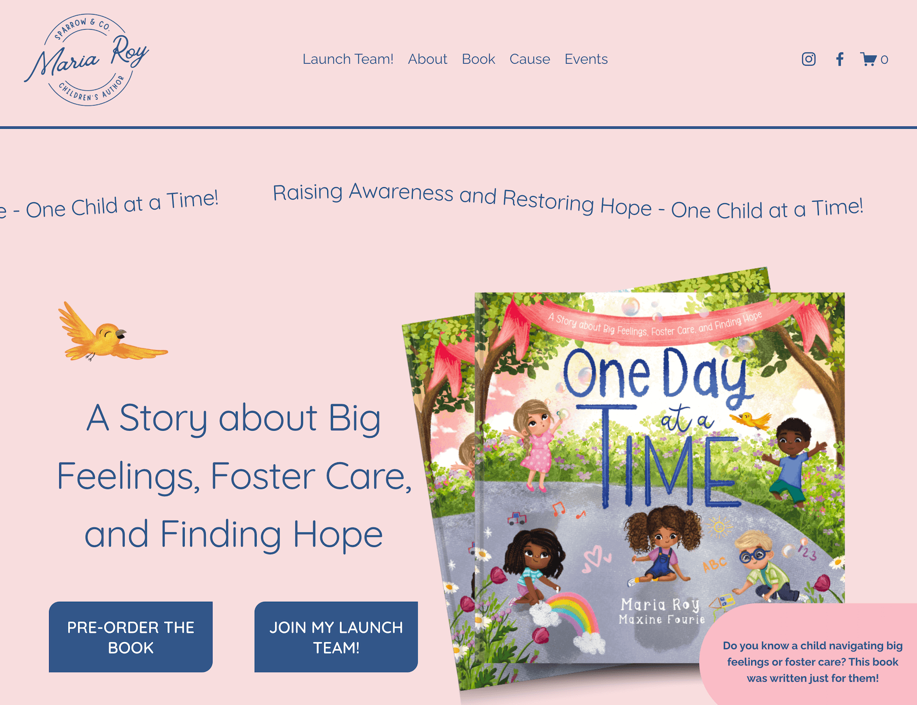
In newspaper speak, this would be described as “above the fold.”
This is because newspapers want the most important story of the day - the one that will get readers to take action AKA buy the newspaper - to be visible to people walking by the newsstand without them having to even unfold the front page.
Why? Because the easier you make it for people to take action, the more likely you are to see results.
Versus the more effort people have to make (unfolding the newspaper, clicking to a second page on your website), the less likely folks are to buy.
Our second example is non-fiction author Anu Partanen. After I read her book, The Nordic Theory of Everything, I visited her site and found that her homepage was a landing page.
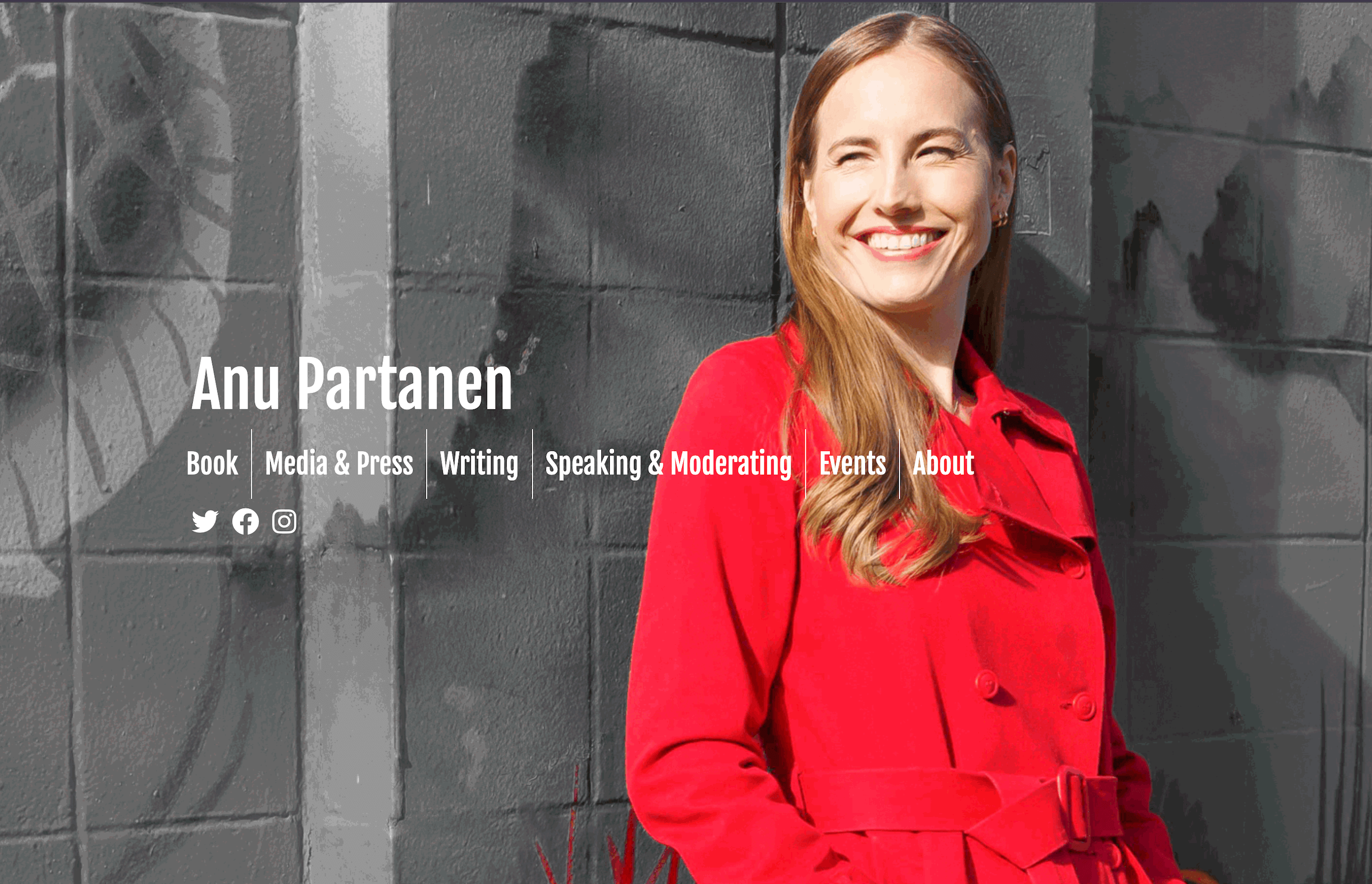
Not only does this force potential readers to click to her book page to learn more - a barrier that creates more effort and therefore decreases conversions - BUT her landing page also forces visitors to choose. Should they click on her book page? Her writing page? Her about page?
The only thing that makes it harder for visitors to become buyers than additional clicks is choices. Why? Because that makes people think. It requires mental energy and decision-making capacity, which psychology has proved to be finite.
So if someone is busy, or tired, or has used up their decision-making capacity for the day, and they come to this site…ugh. More choices!
They don’t want to think or decide; they want you to show them where to go. They want an easy and effortless user experience.
Which is exactly what my new design provides.
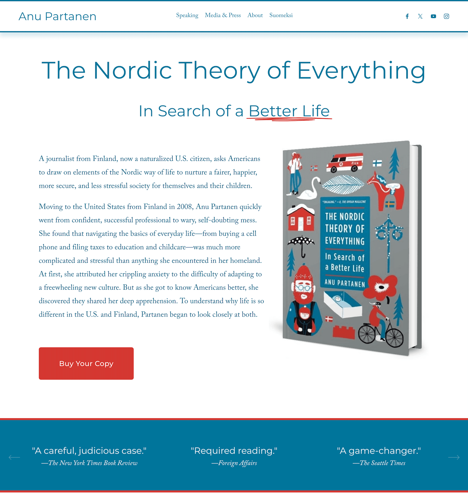
Now the moment visitors land on the site, they know what this website is about and what action they should take. Buy the book. Read the book. It’s simple.
If they’re interested, they can choose to go look at media releases or see what her speaking engagements are about. But for the most important action, there is now NO effort and NO thought required.
Click. Buy. Done.
Final Thoughts: Let Your Books Take Center Stage
You wrote a book. That’s a big deal. Don’t hide it.
Putting your books on your homepage isn’t being pushy—it’s being proud of your work and smart about your website.
It helps people understand who you are, gives your readers what they’re looking for, and sets the stage for more connection (and more sales).
So if your books are currently buried on a hidden page somewhere, consider bringing them into the spotlight. Your readers—and your future self—will thank you.
