
Why Picture Book Websites Should Ditch Black and White

Why Picture Book Websites Should Ditch Black and White
How Thoughtful Color Choices Help Your Brand Speak to Kids—and Their Grown-Ups
When visitors land on your website, you have mere seconds to make a lasting impression. And if you’re a picture book author, your site should feel just as imaginative and engaging as the stories you write.
But here’s what I see all the time: websites built on default settings. White background. Black text.
Nothing necessarily wrong with that… but for a picture book author? It’s a missed opportunity.
That high-contrast, all-business look might work for tech companies or law firms—but it doesn’t reflect the warmth, joy, and wonder of a beautifully illustrated children’s book. It feels off-brand.
That’s why, when I design websites for picture book authors, I almost always recommend moving away from the standard black-and-white combo. Instead, I guide my clients toward colored backgrounds and text hues that are rich, welcoming, and on-brand.
This simple shift—just color!—can completely transform your website.
It helps your brand feel more cohesive, makes your site more inviting, and creates a lasting impression on your target audience.
Let’s walk through why this matters, how to do it well, and what it can do for your brand.
The Problem with Plain Black & White
Most website builders start you off with a white background and black text. And I get it—it’s clean, it’s readable, it’s safe. But “safe” doesn’t always mean “effective.”
For picture book authors, that stark black-and-white look can feel a little too stiff. Too cold. Too corporate.
If your books are filled with color, creativity, and personality (and I’m guessing they are!), your website should feel like a natural extension of that world—not a blank page.
Even if your books are visually vibrant, a plain white website can feel disconnected or forgettable. It doesn’t capture the magic of your work, and it definitely doesn’t help you stand out from the crowd.
Why Color Matters for Picture Book Brands
Color isn’t just a visual choice—it’s an emotional one. It sets the tone for your entire site.
When you use intentional colors on your website, you create a mood that aligns with your stories. Whether that’s cozy and calm, bright and bubbly, or somewhere in between, color helps you build a world your visitors can feel the moment they land on your site.
Here’s what happens when you start designing with color in mind:
You make your audience feel welcome. Soft blush, pale blue, golden beige, mint green—these shades create a gentle, friendly vibe that feels approachable to families.
You reinforce your storytelling. If your book takes place in a forest, a background in soft mossy green with cocoa-toned text could subtly mirror the world you’ve created.
You instantly signal who your site is for. Color speaks volumes. A site with a thoughtful, kid-friendly palette quickly tells visitors—whether they’re teachers, librarians, or parents—“This author writes for children.”
And importantly? A well-chosen color palette sets you apart.
You’re no longer just another author with a plug-and-play site. You’re showing up with clarity, personality, and polish.
Colored Text That’s Still Easy to Read
One question I hear often: “Can I really use colored text and still keep it readable?”
Yes! Absolutely. You just need the right colors—and that’s where a little strategy comes in.
Instead of stark black, I often suggest going with a deep, rich tone that still offers plenty of contrast. Some of my favorite text colors include:
Charcoal gray
Cocoa brown
Navy blue
Dusty plum
Deep forest green
These colors are easy on the eyes, still totally legible, and they pair beautifully with softer background shades. You get the readability you need, without the sharpness of black on white.
Want to be extra confident in your choices? Tools like WebAIM’s Contrast Checker let you make sure your color pairings are accessible across devices and for all kinds of readers.

How Color Strengthens Your Visual Brand
Your website is part of your brand—and your brand is how people remember you.
If your picture book cover is bold and fun and your website is black and white, there’s a disconnect. If your picture book cover has soft, pastel watercolors and your website is black and white, again, there’s a disconnect.
But when your color choices feel like an extension of your book’s world, everything starts to click.
That visual consistency makes a huge difference. It helps readers (and buyers!) instantly recognize your style, and it builds trust. The more your online presence feels intentional, the more people see you as a professional author who knows their audience.
And the best part? You don’t need a huge rebrand to make this work. Sometimes, just choosing a more thoughtful color palette is enough to tie everything together beautifully.
Creating a Kid-Friendly Website That Still Feels Professional
Just to be clear—“kid-friendly” doesn’t mean chaotic or overly colorful. You don’t need to splash every color of the rainbow across your site to appeal to young readers.
In fact, the best picture book websites are often the most balanced. They use color with purpose: to create warmth, support the content, and gently guide the reader’s experience.
Some of the ways I bring color into a site design:
Soft background colors (instead of pure white)
Colored headings and body text in brand-aligned hues
Thoughtful accents—like buttons, quote blocks, or link highlights—in a complementary palette
All of this helps the site feel joyful and kid-appropriate, but also trustworthy and polished.
That’s key, because even though your audience is kids, your website is mostly being used by grown-ups—parents, educators, booksellers, librarians.
They’re looking for an author who feels thoughtful and aligned. Color helps you do that without saying a word.
Examples of Author Sites With Color
First up is picture book author Natalie Horseman, who wrote the Goat On The Go series. She wanted her design to be bright, fun, and child-friendly.
Now, I don’t know about you, but black and white don’t scream bright, fun, and child-friendly to me. So here’s what we did instead.

By substituting a soft blue for the traditionally white webpage background, we accomplished several things:
We made the site bolder and more colorful, which in turn makes it feel more fun and child-friendly.
We strengthened her visual brand, as visitors are more likely to remember her signature sky-blue color than white.
And we played into the themes of the books by pulling the color of Scout’s peaceful farm sky straight from the book cover itself.
Then, to add even more fun color, our text is either deep blue or green. This maintains contrast and legibility while tying Natalie’s strong visual brand even deeper into visitors’ subconscious.
The end result? An on-brand and visually distinct site that visitors will remember.
Now, perhaps you don’t want a bright bold color palette for your site. Can you still replace black and white?
Absolutely. Meet Maria Roy, the author of One Day At A Time. Her brand is much softer than Natalie’s, but we still opted to bring in more color than a traditional black-text-white-background could provide.
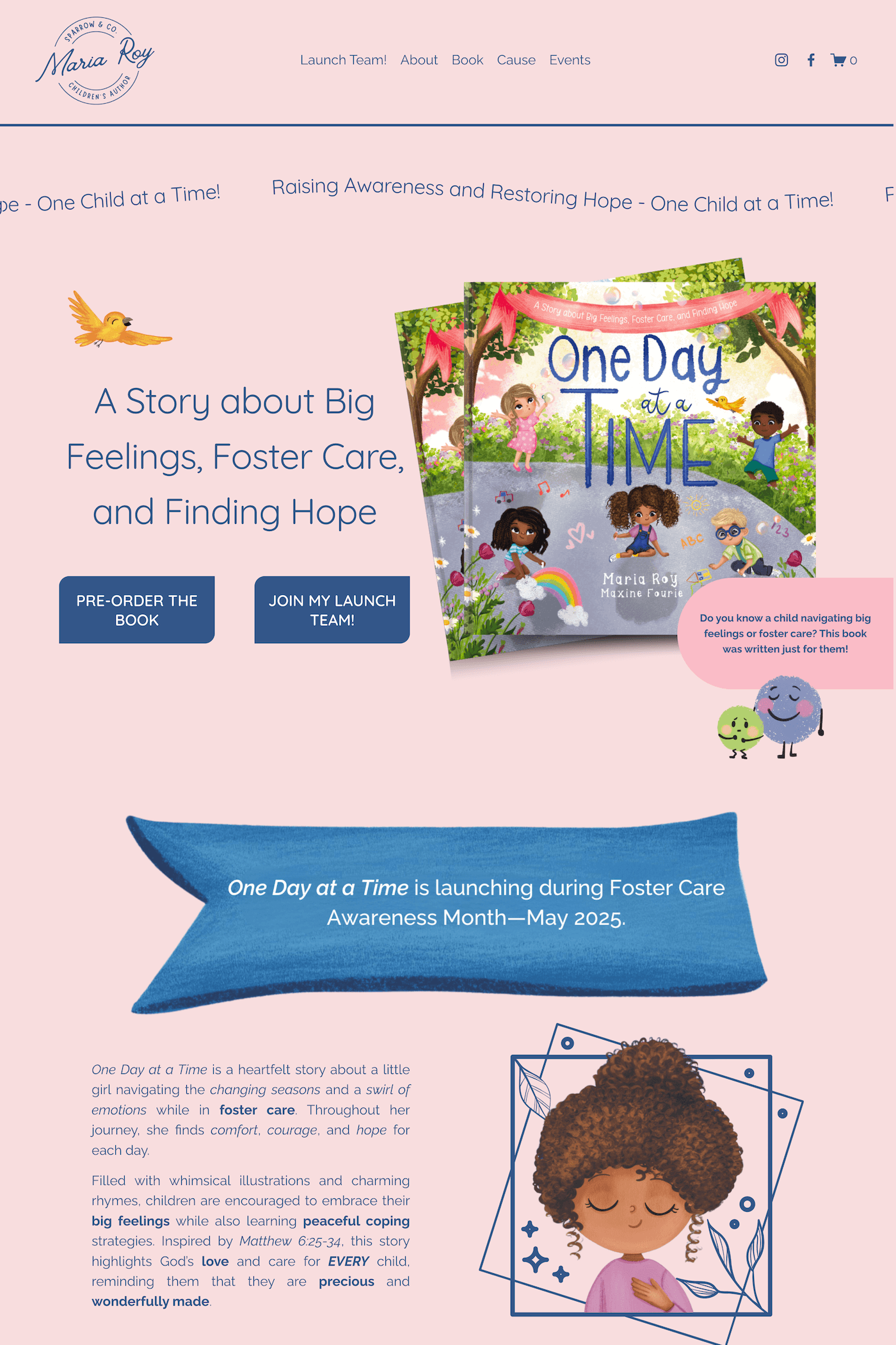
Maria’s soft pink background and deep blue text provide a gentle and calming vibe that matches her book’s theme. The contrast is high enough to maintain easy legibility. And again, people are much more likely to remember this visual brand than just another site in black and white.
Our world is busy and loud. Anything you can do to stick in people’s brains is going to be worth its weight in gold!
Final Thoughts: Let Your Website Reflect the World You’ve Created
You already know how powerful visuals are. Your picture books prove that every day. So let your website be an extension of your creative voice.
By choosing the right colored background and thoughtful text hues, you’re telling your readers—“This is my world. Come on in.”
It’s a small shift that goes a long way in helping your brand feel cohesive, welcoming, and uniquely you.
Need help bringing your picture book brand to life online?
That’s what I specialize in. I design custom websites just for authors—with personality, purpose, and a whole lot of heart. Let’s make your site feel as magical as your stories.
