
Authors, You Have Too Many Pages In Your Website Header Navigation

Clutter Chases Readers Away
Picture this: A potential reader stumbles across your book on social media, is intrigued, and clicks through to your author website.
They land on your homepage and are immediately hit with a website navigation bar that looks like this:
Home | About | Books | Series 1 | Series 2 | Blog | Events | Media Kit | Contact | School Visits | Awards | Book Clubs | Reviews | Newsletter
What do you think happens next?
If you guessed "they spend time exploring all your amazing content," I hate to break it to you—but you're wrong.
That reader just experienced what psychologists call "choice paralysis," and there's a really good chance they bounced right off your site without clicking on anything at all.

Your website header design might seem like prime real estate for showcasing everything you have to offer, but cramming it full of navigation links is actually doing the opposite of what you want.
Instead of guiding readers deeper into your world, you're overwhelming them right out the door.
The Problem: Navigation Overload is Hurting Your Author Website Design
I see this constantly when I'm researching author websites.
Website headers packed with 10, 12, even 15+ navigation options.
Authors think they're being helpful by giving readers "all the choices," but what they're actually doing is creating a user experience nightmare.
Here's what's really happening in your reader's brain when they see that cluttered website navigation menu:

"Okay, where do I even start? Do I want to read about the author first, or jump straight to the books? Wait, there are multiple series—which one should I look at? Oh, there's a blog... and events... and what's a media kit? This is a lot. Yikes. Maybe I'll just come back later."
Spoiler alert: They probably won't come back later. Or ever.
Why do authors fall into this trap?
Because we're thinking like authors, not like readers. We want to showcase every single thing we've accomplished, every service we offer, every way someone can connect with us.
But what feels comprehensive to us feels overwhelming to readers.
The Psychology Behind Why Website Navigation Best Practices Matter for SEO
There's real science behind why simpler author website navigation works better, and it all comes down to how our brains process choices.

Hick's Law tells us that the more options you present to someone, the longer it takes them to make a decision.
Think about the last time you went to a MASSIVE bookstore. It was probably a great experience…but it also may have been overwhelming.
\When you want to buy a romance book, looking at a row of a thousand romance novels can make it hard for your brain to actually pick one
And in the world of websites—where attention spans are measured in seconds—a longer decision time usually means no decision at all.
Then there's Choice Paralysis—the phenomenon where too many navigation menu options lead to no action whatsoever.
It's like standing in the cereal aisle at the grocery store, staring at 47 different options, and walking away empty-handed because choosing feels too hard.
Your website visitors are also dealing with Cognitive Load. This means their brains can only process so much information at one time before they get overwhelmed and shut down.
Every additional navigation link adds to that cognitive burden, increasing the chance of choice overwhelm…and chasing users away from your website.

And here's the kicker: most users expect to find what they're looking for within two to three clicks.
But if your website navigation design is so cluttered that they can't figure out where to go first, you've already lost them—and hurt your SEO rankings in the process.
Now users are fleeing, and Google is ranking your website lower. Ouch!
The Magic Number for SEO-Friendly Navigation
So what's the solution?
Enter Miller's Rule, a psychological principle that's been around since the 1950s, but is more relevant than ever in website design.
Psychologist George Miller discovered that the average human brain can effectively process about 7 items (plus or minus 2) at one time.
This means your absolute maximum for website navigation items should be 5-7 options—but here's the key: if you can get it down to fewer, that's even better.
Take my own website, for example. Lynn Krueger Designs has just three navigation links in the header plus a CTA button.

Three pages. That's it. And it works beautifully because every single link serves a clear, essential purpose.
Research consistently shows that websites with optimized navigation menus containing 3-7 items (with 3-5 being ideal) have:
Higher conversion rates
Longer time spent by visitors on the site
Better user experience scores
More completed actions (like newsletter signups or book purchases)
Improved SEO performance (which translates to higher Google ranking)
For author website design specifically, this translates to readers who actually stick around to learn about your books instead of bouncing away in confusion.
In summary, the fewer choices you give your website visitors, the more likely they are to make a choice at all.
What Should Actually Live in Your Author Website Header

Okay, so if you’re aiming for 3-5 navigation items, how do you choose what makes it into your author website header?
To figure this out, let’s do some brainstorming. However, you need to think like your reader, not like yourself.
You might want to show off everything on your author website, but your readers come to your site with one primary goal: to learn about you and your books. Everything else is secondary.
Here's what I recommend for different types of author website navigation—and notice how starting small is perfectly fine:
For Debut Authors (3 pages):
Books Page
About Page
Blog (but only if you actively maintain one!)
For Multi-Book Authors (4 pages):
Books Page
About Page
Blog (if it adds real value)
Events (only if you do them regularly)
For Established Authors with Multiple Series (5 pages):
Books Page
About Page
Blog
Events
Media (if you have reviews, interviews, etc. with impressive outlets)
Remember: these are maximums, not goals.
If you can accomplish everything your readers need with fewer pages, that's not a limitation—that's optimization at its finest.
There are exceptions to the above recommendations, of course. If you offer author visits or critique services, that page may receive a spot in your header. Or if you are pulling together a launch team for your debut, highlighting that in your header navigation can increase participation.

This is why every client I work with receives a personalized website structure, which we outline together during our initial consultation.
Some designers pre-determine the pages in their author website package. For instance, every single author receives an “About Pages,” “Books Page,” “Contact Page,” etc.
But I believe the structure of your website should be tailored to your literary career and goals. Maybe you need 5 pages, or maybe your site would be better optimized with three. The choice all depends on how you want your career to progress.
Remember - for website headers, less is always more.

The Biggest Website Header Design Mistake
Here’s something that drives me absolutely crazy: authors who waste one of their precious navigation menu spots on "Home."
Why is this a mistake? Because your logo already serves as your home button!
This is a web design convention that's been around for decades. Users instinctively know that clicking on a website's logo will take them back to the homepage.
It's so ingrained in user experience behavior that including a separate "Home" navigation link is not only redundant—it's actually confusing.
By removing "Home" from your website navigation, you free up valuable space for something that actually adds value for your readers.

Use that spot for "Events" if you do school visits, or "Media" if you regularly appear on podcasts, or "Newsletter" if building your list is a priority.
Your logo is working overtime already—let it handle the home navigation duties while your website header focuses on the content that matters most for your author website optimization.
Where Does Everything Else Go in Your Author Website Design?
"But Lynn!" I hear you saying. "I have SO much more I need to include! What about my awards page? My book club questions? My media kit? My speaking topics?"
Here's the thing: just because content is important doesn't mean it belongs in your main website navigation menu.

Footer Navigation is perfect for secondary pages that some visitors might want but aren't essential for everyone. Things like:
Privacy Policy
Awards
Media Kit
Book Club Questions
Speaking Information
Dropdown Menus can work for organizing related content, but use them sparingly in your author website navigation.
A "Books" dropdown that shows your different series can be helpful. But a dropdown with eight different options defeats the purpose of streamlined navigation.
Instead, utilize your footer space to highlight all your other goodies.
For instance, here is my footer.

I highlight three categories in my footer.
The “Key Pages” are the most important pages on my website (some of which are in the header, some of which are not).
The “Learn” column highlights free resources that I offer.
“Recent Blog Posts” is an automatically updating block that displays my most recent blog content.
A footer is great for when a website visitor wants to dive deeper into your content. They’ve already clicked on your “Books” and “About” pages, gotten familiar with who you are, and now are ready to dive deeper.
This way, you avoid overwhelming new visitors to your website, but still have a place where returning visitors can explore more of your content.
It’s the best of both worlds.
The Website Navigation Design Transformation in Action
Let me show you what optimized author website navigation looks like in practice.
Before (12 navigation items):
Home | About | Books | Series 1 | Series 2 | Blog | Events | Awards | Media Kit | Contact | Book Clubs | Newsletter
A reader lands here and thinks: "Where do I even start?"
After (5 navigation items):
About | Books | Blog | Events | Media
The same reader thinks: "This looks manageable. I'll start with Books."
See the difference?
The second version doesn't have less information—it's just organized in a way that guides the reader instead of overwhelming them, following website navigation best practices.
In the streamlined version, awards might live on the About page, book club questions could be on the individual book pages, and the media kit could be easily accessible from the Media or Contact page.
Same content, better user experience, and improved SEO performance.
Learning From Real Author Examples
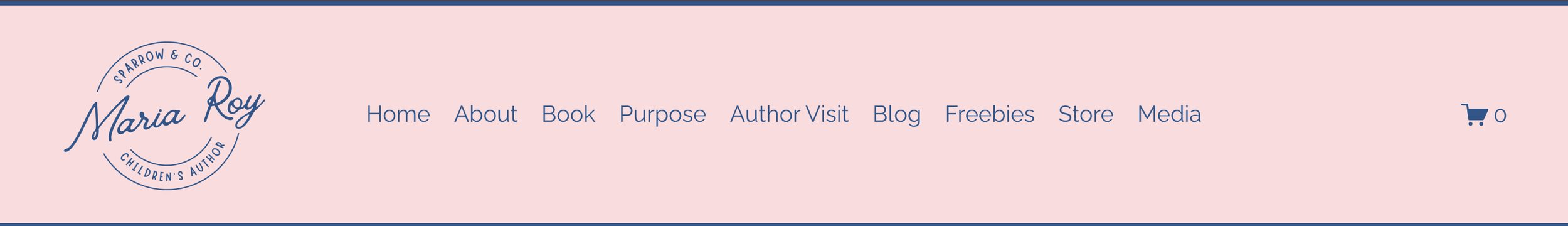
For author Maria Roy’s Sparrow & Co. website, we chose the five most important pages for the header. The result is simple, clean, and straightforward navigation.

All other pages, plus a subscription box, were delegated to the footer of her website. This way, visitors can find all content, including her shop and blog, easily—but they are not overwhelmed when they first land on her website.

Just imagine if instead, we had included all of her pages in the header navigation. The result would have looked something like this:
Whew - I feel overwhelmed just looking at all those options. What about you?
Here’s another example. For Tiana Lastra, author of the Usher Realm series, we streamlined her website to four pages, enhancing the user experience.
For her website, we decided on an About page, a Books page, and a page about her Writer’s Journey. Her home page is linked via her logo at the far left.

The only additional pages Tiana needed to link in her footer were her Privacy Policy and Terms & Conditions pages.
This allowed us to center her footer around a newsletter subscription box, while also listing her core pages again on the left and her social media links on the right.

Your Action Plan: Audit Your Current Author Website Navigation

Ready to streamline your website header design? Here's how to approach it:
List everything currently in your navigation menu.
Ask yourself these questions about each page:
Would a first-time visitor to my author website need this immediately?
Does this help readers discover my books?
Could this information live on a different page just as effectively? (e.g., combining “About” and “Contact” pages to streamline your site)
Prioritize ruthlessly. What are the 3-7 most important things a reader needs to know about you and your work? (Remember: aim for the lower end!)
Reorganize secondary content. Find new homes for important-but-not-essential pages in your footer.
Test your navigation. Ask a friend (preferably someone who doesn't know your work well) to visit your author website and locate your author bio, book purchasing links, and contact information. Then ask them how easy it was to find what they were looking for. Was it clear and simple? Or did they feel overwhelmed and have to click through half a dozen pages to find what they were looking for?
Website Navigation Best Practices: Less Truly is More
Here's what I want you to remember: your author website navigation isn't a filing cabinet where you store everything you've ever done. It's a roadmap that guides readers to the content that matters most.
Every additional navigation link you add makes it harder for readers to choose where to go first. And in a world where first impressions happen in milliseconds, you can't afford to make that choice difficult.

Your goal isn't to showcase every single thing about your author career in your website header.
Your goal is to get readers interested enough in you and your books that they stick around to explore further.
Because here's the truth: a reader who easily finds and falls in love with one of your books is infinitely more valuable than a reader who gets overwhelmed by your website navigation menu and leaves without clicking on anything at all.
Trust the psychology, embrace the simplicity, and watch your author website start working harder for your career instead of against it.
When you follow these website navigation best practices, you'll see improved user experience, better SEO rankings, and higher conversion rates.
Want more insights on author website design and optimization? Subscribe to my newsletter for weekly tips on building an author platform that actually converts readers into fans.
